Hallett & Voss. The page is a drawing set that stands up.
- A website concept for an established Chicago practice in workplace, civic and master planning: the industry's language is buildings, so the page builds one
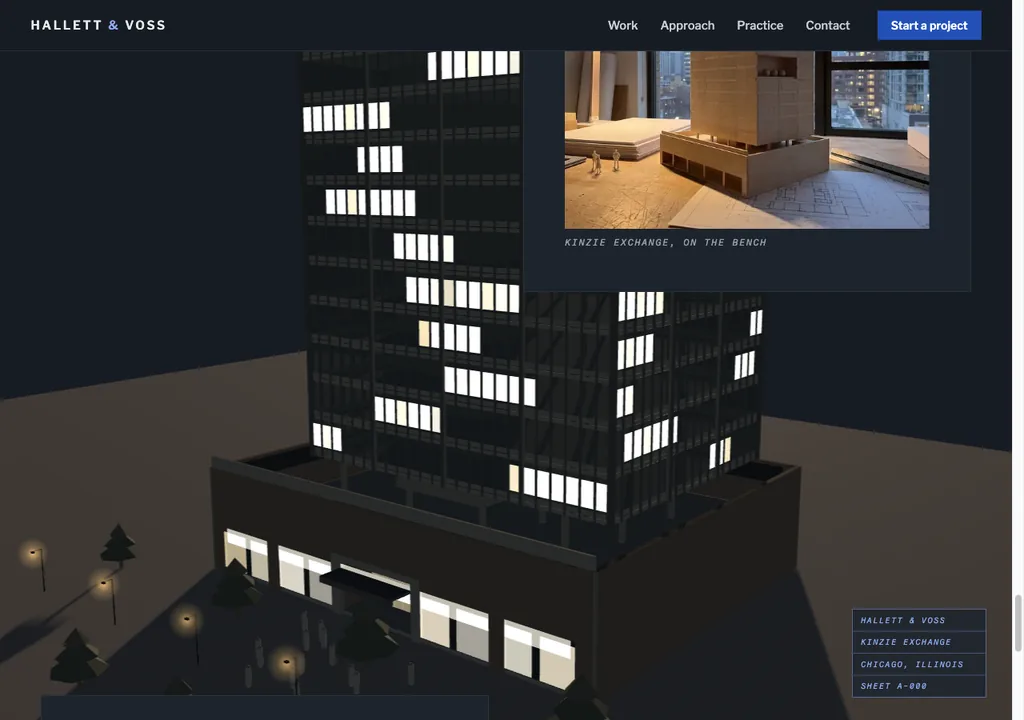
- Cyanotype plan lines extrude into a fourteen-storey massing that casts a real shadow, a section cut opens the core, then the page inverts to dusk and the floors light bottom-up
- 8.3 millisecond median frame time on desktop in testing, 17 milliseconds on a real handset, with a complete reduced-motion experience and full keyboard access
A studio concept by Hammer & Pixel
Hallett & Voss is an invented practice. We build self-initiated concepts to show our approach where client work cannot: the firm is fiction, the brief is real, and so is every line of the build.
The brief
Design a website for an established mid-size architecture practice: around sixty people, workplace and civic work, shortlisted on competence rather than novelty. It had to read as a professional office, and survive the one audience that cannot be bluffed: architects look at buildings for a living, so the building on the page had to hold up close.
The concept
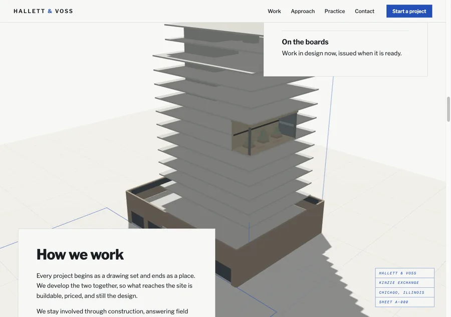
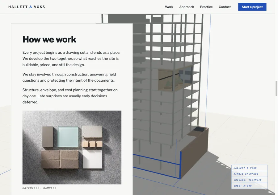
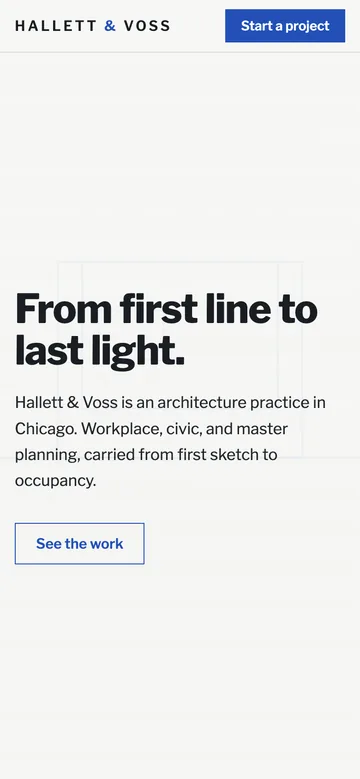
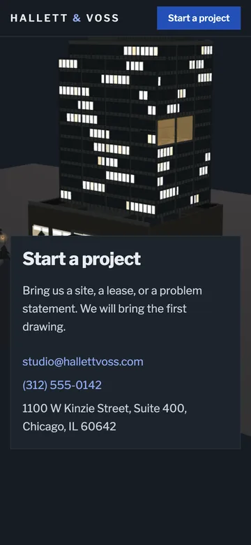
The page is a drawing set that stands up. It opens on a sunlit sheet with a title block and live plan lines, the way a project starts. Scrolling raises it: the plans stack and fan, floors step up into massing, and the first mass throws a real shadow across the paper. Dimension lines and annotations draw themselves near the cursor, so the page has a pencil hand. A section sweeps down the south facade and cuts the building open on print-blue poche. Then the one theme move: the drawing-office white inverts to dusk, the floors warm bottom-up, the winter garden lights first, and the building carries on living after you stop scrolling.
The specification
- An enterprise register on desktop and phone, sober rather than showy
- One continuous 3D model through the whole page, not a sequence of separate scenes
- A building that survives close inspection by people who read drawings
- Annotation and dimensioning that behave like drafting, not like tooltips
- A live section cut through real interior structure, and a living idle state after it completes
- A complete reduced-motion experience and a no-WebGL fallback
- No templates, no frameworks, no engine
- Clear concept labelling on the page itself
What Hammer & Pixel built
- The Blueprint Raising: one continuous model and camera driven by scroll, from plan lines at rest through massing, structure, section, skin and dusk
- The pencil hand: dimension lines and mono annotations that draw themselves near the cursor within one frame
- A real facade module: primary mullions on the nine metre bay, recessed spandrels over dark slab-edge reveals, corner posts and a recessed double-height entry
- A true section cut, not a trick: the core is genuinely hollow, with stair flights, three lift shafts carrying cars, air handling units, and a two-storey winter garden built as a real room
- The inversion: thirteen floors warming in strict bottom-up order inside one screen height of scroll, then a living idle that stops when the tab is hidden
Proof
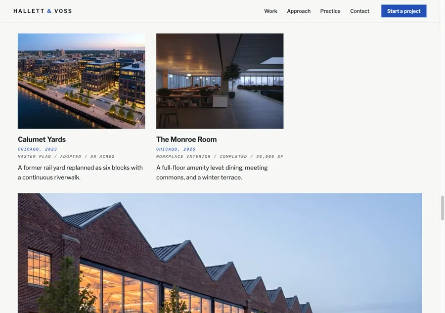
Desktop and phone stills
Walkthrough film
Want this thinking on your own brand?
Serious enquiries receive a homepage concept for their own brand before any commitment. One page, designed properly, so you judge us on work rather than promises.
On Upwork? Message us there instead.