MILTON KEYNES. The price is on the page, before you ring anyone.
- An end of tenancy cleaning firm across forty two pages, built as a prelaunch concept rather than a fiction: the site is finished, the business is not trading.
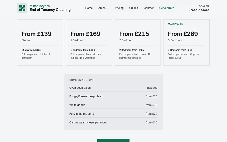
- The full price ladder is published, six rungs from studio to five bed, in a market where four of the five local firms publish nothing.
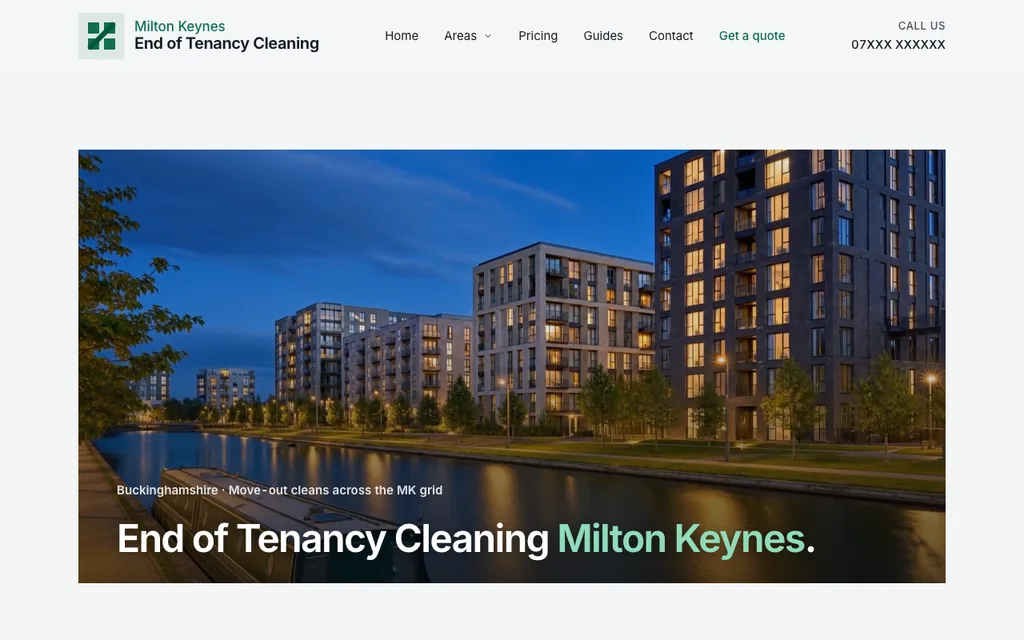
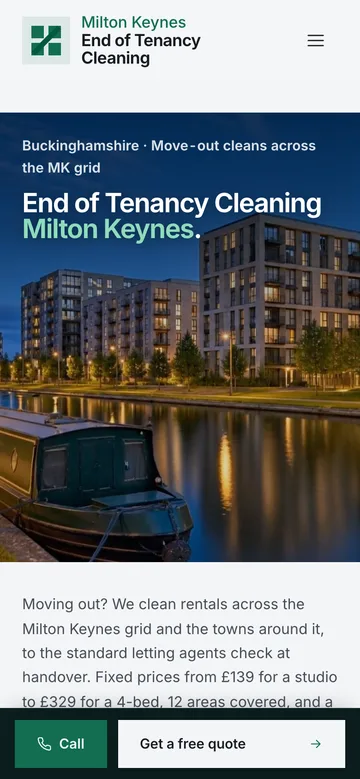
- The hero is a forty second canal loop at blue hour, cropped twice so the title sits over sky on a phone and over water on a desktop.
A studio concept, prelaunch
Milton Keynes End of Tenancy Cleaning is a studio concept, built to launch rather than to demonstrate. The business is not trading yet, so the enquiry form answers with a note saying so and no message reaches an inbox. We build self initiated projects to show our approach where client work cannot: the brief is real, and so is every line of the build.
The brief
Milton Keynes is a grid city, and its rental market moves the way its roads do: legibly, in numbered districts, on job changes rather than academic terms. There is no campus university, so the student peak that shapes cleaning demand elsewhere does not happen here. Deposits average £1,546, and the money at stake in a checkout inspection is real.
What the local trade does not do is publish a price. Four of the five Milton Keynes firms we checked show no figure at all, and none runs a page network at district level. So the brief was to answer the two questions a leaving tenant actually asks, what it costs and whether their area is covered, before anyone picks up a phone. That is a design problem, not a slogan.
The concept
The identity is called Grid and Redway, after the city's grid roads and the redway paths that run beneath them. Square corners everywhere, one jade accent, hairlines instead of card shadows, and tabular figures on every price so the ladder lines up column by column.
The jade was solved as numbers before it was ever seen. The green first picked on screen sat outside the sRGB gamut, so a browser would have quietly clipped it to a colour nobody chose, and it failed AA as a link colour on two of three surfaces. At that hue the gamut caps chroma, and more vivid always means worse contrast, so the accent was resolved down until every text pair passed.
The hero is a canal at blue hour, slowed to half speed and held at forty seconds. Phones get an upright cut with the title over the sky, wider screens a two to one cut with the title over the water.
The specification
- Forty two static pages, hand coded, British English, no framework
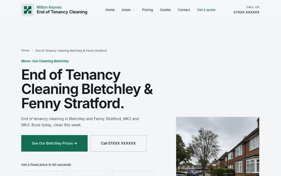
- Twelve area pages, five guides, seven service pages, a hub and six spokes
- Thirty three original images, every frame generated for this build
- A 39.9 second 1600 by 800 desktop hero loop at 4.1MB
- A separate 800 by 1000 upright loop for phones at 2.2MB
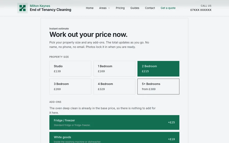
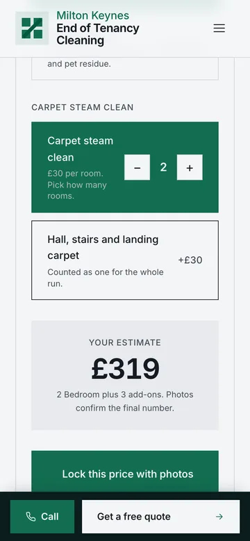
- A cost calculator wired to the ladder and proved against the data twice
- Six published price rungs, with the oven inside the base clean
- Noindex on every page and every asset, so it cannot outrank the real site
- Link gate: 5,502 internal targets resolved on the shipping build, none broken
What Hammer & Pixel built
- The full forty two page site: twelve areas, five guides, seven service pages, a specialist funnel and the cost calculator
- The identity, Grid and Redway: square corners, one jade accent solved numerically, hairlines instead of shadows, tabular price figures
- The hero pipeline: a generated canal still, one motion pass, two free slowdown rounds, then a forty second loop
- The upright hero for phones, cut separately so the title sits over sky rather than cropped off the frame
- The local layer: twelve areas written from ward and census data, each naming the geography it quotes
Proof
Desktop and phone stills
Walkthrough film
Want this thinking on your own brand?
Serious enquiries receive a homepage concept for their own brand before any commitment. One page, designed properly, so you judge us on work rather than promises.
On Upwork? Message us there instead.